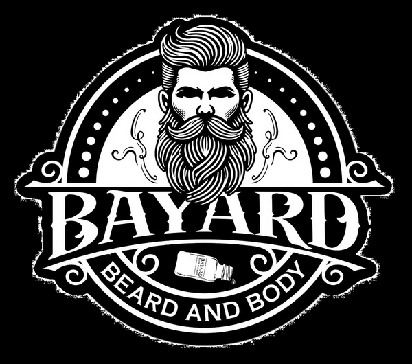
Bayard Beard and Body logo evolution, why the bottle?
Share
Our journey of logo evolution was pivotal in defining our brand amidst a competitive market. Initially, we opted for a straightforward approach—a combination of our name and a beard. It made sense at the time, clearly reflecting who we were and what we offered.

However, as we looked around, we realized many others had taken a similar approach. Whether newcomers or established brands, the concept of "beard meets name" was widespread. We needed something that would resonate uniquely while encapsulating our business focus beyond just beards.
Designing a standout brand that truly represented us, made sense in our product line, and looked appealing was no easy feat. We considered our commitment to organic and essential oils, a cornerstone of nearly all our products. Importantly, we sought a design that would be distinctive in the marketplace.
The breakthrough came unexpectedly, as often happens. While pondering our new logo amidst a display of our products, I accidentally knocked over a freshly filled Boston round bottle. Amidst the minor spill, the bottle resting on its side sparked an idea. It symbolized the essence of our entire product range—simple, symbolic, and directly related to our offerings.
Our logo isn't just a graphic; it embodies our ethos. It signifies our dedication to quality and innovation. So whether you're a customer, an admirer, or even someone inspired by our design (or maybe considering a cheeky imitation), know that our logo carries meaning. It's a reflection of who we are and what we stand for—authenticity, quality, and a commitment to our craft.
As we unveiled our new logo, we felt a sense of pride and excitement. It wasn't just about a new look; it was about reaffirming our identity in a way that would resonate with our community. Our logo now serves as a beacon—a symbol that represents not only our products but also our values and our journey.
With our new logo in place, we embarked on a renewed marketing effort. We shared the story behind its creation, emphasizing the thought and care that went into every detail. This transparency and authenticity resonated with our audience, fostering a deeper connection and trust.
In conclusion, our logo evolution was more than just a design change—it was a strategic decision to differentiate ourselves in a crowded market. It symbolizes our growth, our values, and our commitment to delivering exceptional products. As we continue on this journey, we're excited to see how our logo will continue to evolve and resonate with our customers, old and new alike.


